# Change Styleguides output
This page is meant to show how to customize a styleguide.
It will get you to transform any part of the styleguide.
A good example of a finished customized styleguide is linked in the Examples section.
We will go through each step of the process so that you can completely change the way the styleguide is rendered.
NOTE There is no proper way to use pure CSS to style styleguidist components.
Styleguidist uses JSS to generate the classes and the rules.
If we use the CSS classes that we can find when we inspect the styleguide in the browser, we expose ourselves to changes in the name of those classes.
Indeed, the class names are entirely generated by the JSS engine.
# Prerequisites
- Install vue-styleguidist and check it runs.
- Block the version of your dependency to vue-styleguidist.
- There is no guarantee your customizations will work on every minor update.
- To do that, open the
package.jsonand remove the^before the version of vue-styleguidist
- Learn the basics of ReactJs.
- vue-styleguidist is rendering the styleguide using react-styleguidist (opens new window). All the visible part is made in ReactJs.
- Since we will re-write React components, the more you know the more you will be able to do.
- Install the React Dev Tools extension in your browser.
# Identify the component
We want to change a part of the styleguide. We first have to identify what its name is in styleguidist.
In this step, we will identify which components we need to replace to achieve our transformation.
First, start off your styleguide
npm run styleguide
Open your styleguide in your dev browser.
Then, from your browsers dev tools open the react dev tools.
You should get something like this
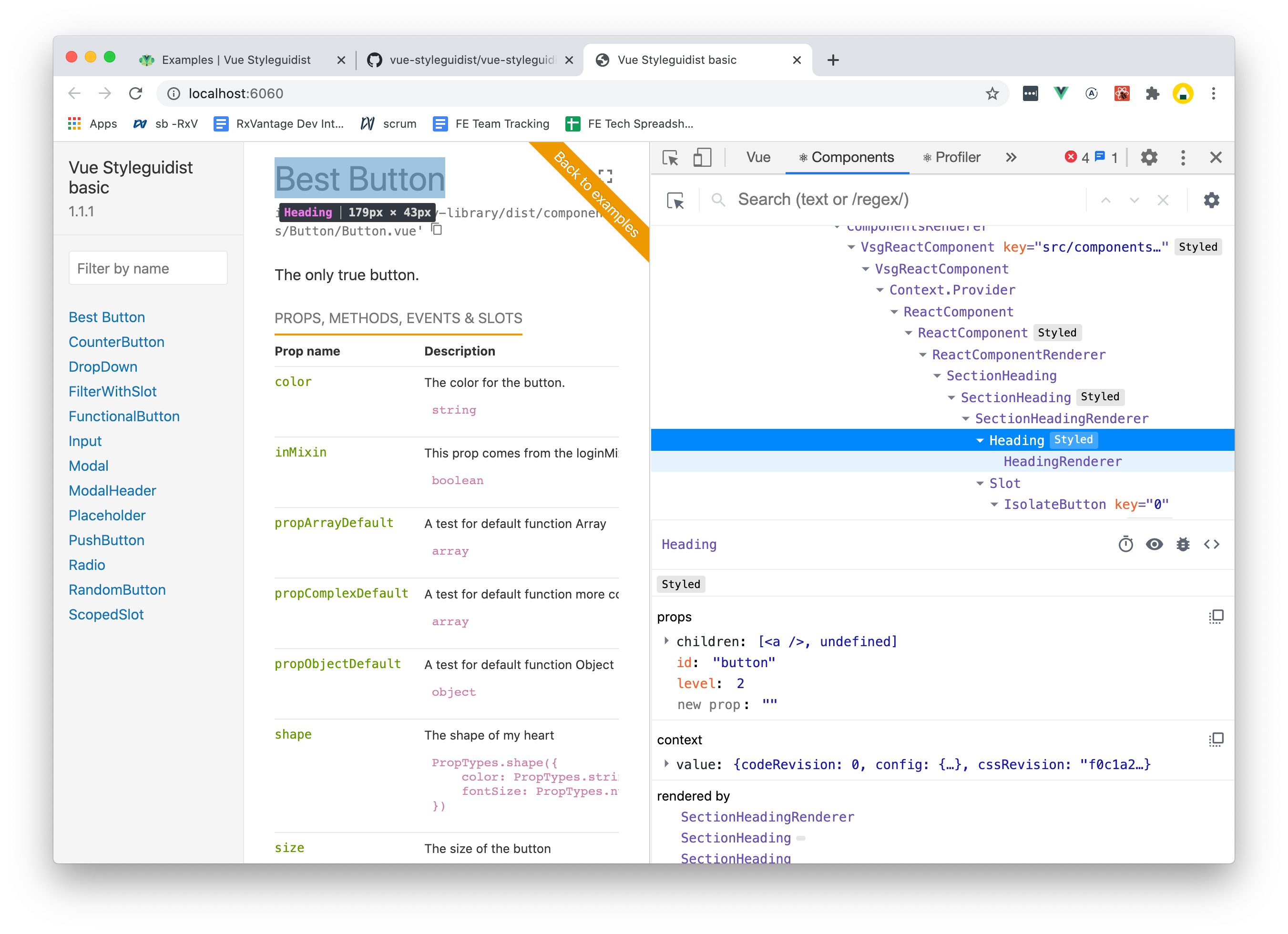
In all components seen on the right, we can either change the styles, or we can replace them by our own.
If we want to change the Section Header with something more complicated, this is how we find its name.
# Locate the component
Vue Styleguidist is made on top of React-Styleguidist. To avoid duplication, a lot of the components from react-styleguidist are used from react-styleguidist.
# Look in vue-styleguidist
To find the source code of the component we want to customize, we look first in vue-styleguidist (opens new window). This is where webpack will look for it first as well.
NOTE: There is no
...RendererorStyledcomponents in this list. If the component we want to customize end withrenderer, we will look for the components without the suffix. The idea is the same withStyled, though styled components can often be ignored.
# Then in react-styleguidist
If we do not find the component in vue-styleguidist it means the system uses a component from react-styleguidist. We look inside this directory (opens new window) for the component.
NOTE If you have to choose between changing the "...renderer" and the original component, always prefer changing the "...renderer". The potential impact on subcomponents is far less dangerous.
In the example of the Section Header, we will find the component it in react-styleguidist here (opens new window)
# Style & Theme
# Change the Theme
To keep the styleguide consistent we can, instead of changing the css of each component update the theme using the theme configuration option.
For example, if we want to change the color of links, we look inside the links code (opens new window). We find that what gives links their color is the value input color.link. Now, everything that is given as a parameter to the Style function comes from the theme.
const styles = ({ color }: Rsg.Theme) => ({
  link: {
    '&, &:link, &:visited': {
      fontSize: 'inherit',
      color: color.link,
      textDecoration: 'none'
    },
    '&:hover, &:active': {
      isolate: false,
      color: color.linkHover,
      cursor: 'pointer'
    }
  }
})
So if we want to change all colors of links from the theme, we add this to our styleguide.config.js
// styleguide.config.js
export default {
  theme: {
    color: {
      link: 'hotpink'
    }
  }
}
Since vue-styleguidist is based on react-styleguidist, they share the same theme interface (opens new window).
The theme object we provide will be merged with the standard theme (opens new window) and injected in all components that take it as a parameter.
# Styled Components
If we want to adjust the styles of a specific component, and we want to keep the HTML output plus the inner logic, we can use the styles options in our styleguide.config.js.
Since we want to change the heading of a section and we previously found the component, we will change the styles of the Heading component we found above.
We start by looking at the components original styles (opens new window).
const styles = ({ color, fontFamily, fontSize }: Rsg.Theme) => ({
  heading: {
    margin: 0,
    color: color.base,
    fontFamily: fontFamily.base,
    fontWeight: 'normal'
  },
  heading1: {
    fontSize: fontSize.h1
  },
  heading2: {
    fontSize: fontSize.h2
  },
  heading3: {
    fontSize: fontSize.h3
  },
  heading4: {
    fontSize: fontSize.h4
  },
  heading5: {
    fontSize: fontSize.h5,
    fontWeight: 'bold'
  },
  heading6: {
    fontSize: fontSize.h6,
    fontStyle: 'italic'
  }
})
To make the heading color green, we update the style heading2 used. To do so we will add the following to our config file.
// styleguide.config.js
export default {
  styles: {
    // First level of keys will be the component name
    Heading: {
      // Second level will be the class name
      heading2: {
        // Finally we use JSS to style the components
        color: 'green'
      }
    }
  }
}
All the styles above use JSS to render styles.
Confer to the JSS documentation (opens new window) to undersand what value JSS options can take.
# Change components
If changing the styles is not enough and we want to add content or change the HTML returned by our component, we have to override them completely.
We have located the component we want to override. Since we have access to the source of the original component, we will copy and paste the files in your code base.
Do not bother copying the test files if any (they end with .spec.js,ts or tsx). They would make the process unnecessarily more complicated. You would have to setup jest with babel and typescript in your own codebase to run those tests properly.
# Register Components
Now that we have the files for the components that we want to change, we have to tell vue-styleguidist where they are. To this end, update the styleguideComponents option in styleguide.config.js with the path to your newly created component files.
# Set-up babel
Now that we have our components code, we can see that the components use the JSX syntax from react. This syntax is different from the one of VueJs. The two syntaxes are not compatible. So even if we use JSX in our Vue components, we will have to change the babel config.
For an sample configuration, you can look at the customised (opens new window) example.
Don't forget to install @babel/plugin-transform-react-jsx in you dev dependencies.
module.exports = {
  presets: ['@babel/preset-env'],
  plugins: ['@babel/plugin-transform-runtime'],
  comments: false,
  overrides: [
    {
      // only process jsx with react style for styleguide components
      include: ['**/styleguide/components/*.{js,vue}'],
      plugins: ['@babel/plugin-transform-react-jsx']
    },
    {
      // For vue components process jsx with the vue style
      include: ['**/src/components/**/*.jsx'],
      plugins: ['transform-vue-jsx']
    }
  ]
}
We are now free to modify the component file we own. Once we start the styleguide development environment, every save of our new component file will be reflected on the rendering using hotm module replacement.
Happy Styling!